Shoppers notice LCD writing tablets work in bright rooms without any glow. Then questions follow: Will my users see the strokes clearly? Is it durable? How do we assess quality without a spec sheet? This guide explains the underlying display physics and turns that into clear buying decisions.
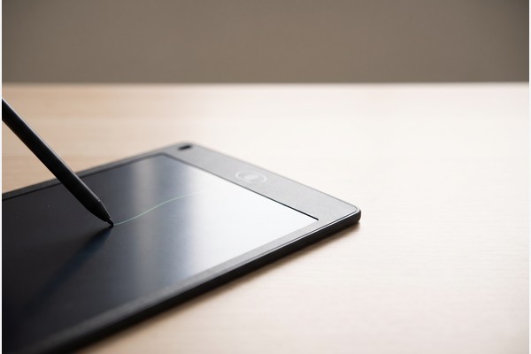
An LCD writing tablet creates a visible line without a backlight by using a pressure-responsive, reflective liquid crystal film. Pressing the surface locally reorients the liquid crystal structure and changes how it reflects ambient light, producing a contrasting stroke against a dark backing. A brief electrical pulse (the erase button) resets the film to its baseline state for reuse.
Below we translate the physics into practical procurement choices—what to ask, what to test in samples, and how to compare options for your brand and market.
How does an LCD writing tablet draw a visible line without a backlight?
If you have ever wondered how LCD writing tablets work without the glow of a lamp, the key is reflectivity, not emission. The screen is built from a pressure-responsive liquid crystal film above a dark background. When you press with a stylus or fingernail, microstructures in the film locally change orientation. That orientation change alters how those tiny regions handle room light—scattering or reflecting it differently than the surrounding, untouched areas. The result is a bright, contrasting line that appears to sit “on” the surface, even though no LEDs are lighting it from behind.
In many common designs, the film uses a bistable liquid crystal mode. “Bistable” means it can hold two visual states—one more reflective and one less reflective—without constant power. Mechanical pressure toggles a small patch of the film from the baseline state to the alternate state, so a line persists after you lift the stylus. Because the written content is formed by ambient light bouncing off the microstructure, the tablet behaves like a reflective LCD display: clear and high-contrast in good lighting, and progressively lower-contrast as the environment gets dimmer.
What changes in the film when you write
At a conceptual level, the display stack includes a top protective sheet, a thin, pressure-sensitive liquid crystal layer, and a dark absorbing layer behind it. Under gentle pressure:
- The liquid crystal in the contacted region mechanically reorients.
- That local orientation shift changes how the region reflects certain wavelengths of ambient light back to your eyes.
- The dark layer behind the film enhances contrast by absorbing stray light where the film remains in its baseline state.
Nothing glows; the stroke is visible because it reflects or scatters the light already in the room. The physics is the same reason printed paper is visible under a desk lamp without electronics—it reflects light.
Why lines stay until you erase
Unlike typical backlit LCDs that need constant power to hold an image, many erasable writing tablet films are bistable. After you lift the stylus, the affected regions remain in their written state until an external event (usually a brief electrical pulse from the erase circuit) resets the orientation for the entire panel. This “write once, hold image” behavior explains the low power profile of an electronic writing pad used purely for jotting or doodling.
For buyers, the takeaway is simple: the apparent “brightness” of strokes comes from ambient light management, not from a lamp or backlight. Evaluate samples under the same lighting in which your users will write. If your channel includes classrooms, offices, and kitchens, test in each to understand how placement affects visibility.
What makes the line thicker or thinner—how does pressure-sensitive LCD writing behave?
Pressure changes the size and intensity of the written region. In pressure-sensitive LCD writing, a light touch barely reorients the film, creating a thin, faint trace, while a firmer press deforms a wider area for a bolder stroke. But pressure is only one part of the equation. Stylus tip geometry, film formulation, substrate stiffness, and even temperature affect the resulting line visual.
Key factors that influence stroke appearance
- Stylus tip size and shape: A soft, rounded tip spreads pressure over a wider area than a hard, fine tip. In side-by-side sample testing, buyers often find the same tablet writes “thicker” with a blunt tip than with a sharper one under the same hand pressure.
- Substrate stiffness and support: A tablet with a slightly more compliant backing can yield broader lines for a given force, because the film and backing flex together. Conversely, a very rigid backing can concentrate force into a finer mark.
- Film responsiveness: Different writing films transition at different pressure thresholds. Some change state readily with a light touch; others require more force to achieve the same contrast. Always verify real-world usability in your own samples; do not rely on generic claims.
- Ambient temperature: Liquid crystal behavior varies with temperature. Extremely cold conditions can make strokes lighter or less uniform; warm conditions may increase responsiveness. If your market includes outdoor or warehouse use, include a temperature range test in your sampling plan.
- Handwriting style: Users who press harder produce bolder lines; users with a light touch may prefer a stylus with a broader or softer tip to increase effective pressure.
How to specify stroke feel in procurement language
- Define intended users and tasks: “Primary use is quick grocery notes on a fridge” versus “math practice for early learners” implies different stroke visibility and tip durability needs.
- Identify stylus parameters in your brief: Include tip material concept (e.g., soft polymer vs. hard plastic), approximate tip diameter, and whether a tether is desired.
- Request side-by-side samples: Ask the supplier to include at least two film options, two stylus tip shapes, and one alternate substrate firmness so you can evaluate stroke visibility across conditions.
- Document evaluation lighting: Record the lux level or at least the basic lighting type (sunlight near a window, office LED panels, evening lamp) when you judge contrast. This avoids surprises after launch.
The outcome is not simply “thin” or “thick.” It is a blend of tactile feel, pressure response, and viewing conditions. Specifying and testing these together gives you a more predictable user experience.
How does the erase button work and what power does the tablet actually need?
Writing requires no power because mechanical pressure sets the film state. Erasing typically uses a short electrical pulse applied across the writing film to realign the liquid crystals to their baseline (blank) orientation. The erase event is brief; after it, the film again holds its blank state without power. This is why the common product category of erasable writing tablet can go through many erase cycles without continuous battery drain.
From a buyer perspective, there are three key implications.
Erase behavior to confirm in samples
- Full-panel erase: Basic designs erase the entire screen uniformly. If your use case requires selective or partial erase, do not assume it is supported—ask the supplier for confirmation, documentation, and a working sample.
- Residual “ghosting”: Minor residual traces can sometimes be visible in certain lighting or after repeated pressure in the same region. Evaluate multiple erase cycles and look across viewing angles before you approve final visuals.
- Erase timing and feedback: Some products erase almost instantly; others take a brief moment. If your application involves a classroom or fast-paced workflow, confirm the timing matches your user expectations.
Power source and compartment considerations
Many designs use a small replaceable battery to provide the short erase pulse. Do not assume a specific cell type or life; request exact details in quotation, along with a pre-production sample that demonstrates expected erase performance. If your product uses a button or coin cell for erasing and you plan to ship in the United States, review the U.S. Consumer Product Safety Commission’s Button Cell and Coin Battery Business Guidance for information related to battery compartments and labeling. Requirements vary by market and by final product configuration; seek market-specific advice and request applicable documentation from your supplier.
For U.S.-facing toy or child-directed products, classification and related obligations can differ from general stationery. The CPSC’s Toy Safety Business Guidance is a useful starting point for understanding how product type and intended user can influence applicable requirements in the U.S. Always conduct a configuration- and market-specific review with appropriate experts, and confirm any required warnings, instructions, and age grading in your packaging and documentation.
In short: a quick pulse resets the film; writing itself is power-free. Confirm erase behavior in samples, and handle battery compartment and labeling topics deliberately during specification, especially for children’s channels and U.S. distribution.
When is writing easiest to see, and when is it harder?
Because the display is reflective, not emissive, contrast depends on ambient light. Under bright, diffuse light—daylight near a window or a well-lit office—strokes appear vivid against the dark backdrop. In dim environments, contrast falls. Users can still write, but the difference between written and unwritten regions narrows, similar to reading a printed page under a low-watt lamp.
Consider these practical visibility factors when evaluating samples:
- Lighting type: Diffuse room light generally yields stable, legible contrast. Point-source glare (a bare bulb directly overhead) can wash specific areas. Tilt the tablet while evaluating to understand how the surface handles reflections.
- Viewing angle: Many films remain readable at wide angles, but oblique angles can change perceived contrast. Test seated, standing, and from the side—especially if tablets will be wall-mounted.
- Stroke color tone: Different films reflect different hues in their written state (commonly greenish or bluish appears against a dark field). The perceived “pop” of the stroke depends on both hue and surrounding light color temperature. Match to your brand’s intended setting.
- Background darkness: The darker the backing layer appears, the higher the potential contrast in bright light. Confirm the visual with production-intent materials.
- Surface finish: Matte surfaces reduce glare and help under spotlights; glossier finishes can look crisper in diffuse light but may show more reflections from point sources.
For school and family audiences, it can help to describe the experience in familiar terms: “It reads like paper in daylight.” For dim bedrooms or evening use, buyers sometimes pair tablets with ambient room light or instruct end users to tilt toward available light. If your use case demands viewing in the dark, a reflective LCD display is not a backlight substitute—consider your lighting plan or a different display class for that environment.
Which note-taking display fits your use case: reflective LCD, backlit LCD, or e-paper?
Choosing the right product type depends on where and how customers will use it. The table below contrasts high-level characteristics of three common approaches, so decision makers can align expectations before requesting quotes. This is a qualitative guide for scoping and does not represent specific specifications; always validate with samples.
| Display approach | How it forms an image | Power while writing/holding | Visibility in bright light | Use in a dark room | Erase/refresh behavior | Writing feel | Typical use cases | Key considerations |
|---|---|---|---|---|---|---|---|---|
| Reflective pressure-based LCD (LCD writing board technology) | Mechanical pressure changes liquid crystal orientation; ambient light creates contrast | No power to write or hold; brief pulse to erase | Very good; benefits from more ambient light | Needs room light; no backlight | Usually full-screen erase via button | Immediate, no lag; thickness varies with pressure | Quick notes, kids’ doodles, fridge lists, classroom practice | Evaluate line contrast under real lighting; confirm erase behavior and battery compartment requirements |
| Backlit LCD/Tablet | Electrically controlled pixels modulate a backlight | Requires continuous power for image and light | Readable but can be washed out in glare | Excellent; display provides its own light | Digital undo/erase; selective edits possible | Digital pen feel; can have latency depending on system | Multimedia, apps, connected workflows | Battery life, blue-light policies, higher cost and complexity |
| E-paper (reflective electrophoretic) | Electrophoretic particles move under voltage; holds image without power | No power to hold; power to change image | Paper-like; strong in bright light | Needs front light for dark rooms | Full-screen or partial refresh; may have visible refresh | Varies; often not true “pressure write” without digitizer | Retail signage, dedicated e-readers | Refresh artifacts, slower changes, specialized controllers |
For a simple, reusable note surface with near-zero active power and instant strokes, an electronic writing pad with a reflective film is usually the right category. For app-connected workflows or night-time reading, a lit display class may fit better. Decide at the category level first; then request detailed samples within your chosen approach.
Standard options
The list below describes familiar buyer choices often seen in this category. Do not assume every option is offered by every supplier or in every catalog. Ask explicitly—“Please confirm catalog availability”—and verify in a current sample before committing to artwork or packaging.
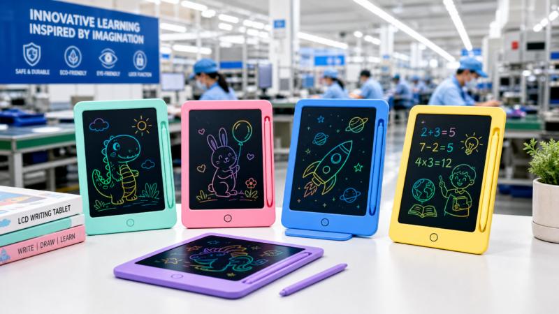
- Form factors and sizes: Compact, mid-size, and larger boards for desks or classrooms. For a sense of a compact format commonly used in backpacks and fridge notes, see the 8.5-inch LCD writing tablet page.
- Bezel and housing colors: Neutral office tones, school-friendly colors, or seasonal palettes. If you plan multiple colorways, specify Pantone targets for quotation and sample matching.
- Writing surface tone: Background field and stroke hue combinations vary by film type. Request samples to compare contrast and brand fit across “green on black,” “blue on black,” and other variants.
- Stylus styles: Slim pen, wider grip stylus for younger hands, integrated clip, or slot-in storage. Consider tip material and diameter alongside pressure feel.
- Tethering and holders: Coiled tether, lanyard loops, or magnetic holders to keep the stylus with the tablet.
- Mounting aids: Integrated magnets for refrigerators or whiteboards; stands or kickstands for desks. Confirm magnet strength and placement through real-world tests.
- Lock slider: A mechanical or electronic lock that disables the erase button to prevent accidental clears during transport. Validate lock behavior in samples.
- Multi-color writing region designs: Some products present zones that write in different hues. If you are exploring a colorful family-oriented concept, review the OEM multi-color drawing tablet set page for a high-level idea and then request samples for your brief.
- Packaging and inserts: Retail clamshells, paperboard boxes, or mailer-friendly packs; include instructions and warnings sized to your markets.
Each of these choices can affect perceived contrast, durability, and end-user satisfaction. Combine them into a single, documented brief for supplier quotation and sampling.
Customization notes
If you are considering custom tooling, graphics, or performance tuning, it is critical to define your brief precisely and request confirmation, applicable documentation, and pre-production samples. The items below outline details to align before a custom project.
- Intended users and markets: Who will use it (e.g., adult office, primary school, family kitchen) and in which countries or regions. This influences age grading, warnings, and packaging language.
- Display performance target: Specify the lighting scenarios in which you expect strong contrast (e.g., “typical classroom LED lighting” or “north-facing home kitchen during daytime”), and the minimum stroke visibility you expect under those conditions.
- Stroke feel: Desired stylus geometry, writing pressure feel, and any specific feedback (e.g., “avoid overly thick strokes at light touch”). Include stylus storage or tether expectations.
- Erase behavior: Confirm whether full-screen erase is acceptable, the expected erase timing, any lock/disable function, and how you want the erase button presented visually and tactilely.
- Power source and compartment concept: Identify the general power approach for erase. If a button or coin cell is contemplated for U.S. channels, review the CPSC’s Button Cell and Coin Battery Business Guidance and define your warning label approach and compartment strategy accordingly. Requirements differ by market and final configuration; obtain market-specific advice.
- Housing and finishes: Color targets, surface textures, logo placement, and any soft-touch or matte/gloss preferences to manage glare and fingerprints.
- Magnets or mounts: Placement, strength targets, and interference considerations for environments with sensitive equipment.
- Packaging and documentation: Insert languages, quick-start illustrations, care instructions, and any market-required warnings. For products directed to children in the U.S., consult the CPSC’s Toy Safety Business Guidance as a starting point for understanding classification topics. Conduct a configuration- and market-specific review.
- Environmental conditions: Storage and operating temperature ranges for your channels (e.g., unheated garages, hot car interiors). Request performance validation within those ranges.
- Artwork workflow: Vector logo files, color references, and mockups. Agree on proofing stages (digital proof, white sample, pre-production sample) and approval checkpoints.
Do not assume a customization is available. State what you want, ask the supplier which elements are feasible, and secure examples that match your expectations before you move to bulk production.
Buyer checklist
Use this checklist to turn technical concepts into actionable steps. Separate hard requirements from items to verify in quotation and in a pre-production sample.
Confirmed requirements to include in your brief:
- Intended users, environments, and markets (e.g., “family kitchen notes in the U.S. and Canada” or “primary classroom practice in well-lit rooms”).
- Category decision (reflective LCD erasable writing tablet versus other display classes) aligned to use in ambient light.
- Target writing feel and stylus concept (tip shape, tether, storage), with sketches or references if possible.
- Erase behavior and user controls (full-screen erase, lock function concept, button placement).
- Mounting concept (magnets, stand, wall hooks) and any constraints (e.g., interference concerns near appliances).
- Color and finish direction (housing color, logo placement, surface texture to reduce glare/fingerprints).
- Packaging format and languages; plan for instructions and warnings as required by market and classification.
Details to confirm explicitly in quotation (“Please confirm catalog availability” or feasibility for custom):
- Writing film color/contrast options and sample part numbers.
- Stylus SKUs and compatible storage features.
- Presence and design of an erase lock, if requested.
- Battery approach for erase and the battery compartment design concept.
- Magnet placement and indicative holding power under real conditions.
- Any multi-color writing region concepts you intend to evaluate.
Items to validate in a pre-production sample before mass production:
- Stroke contrast under your defined lighting scenarios and viewing angles.
- Erase performance (speed, uniformity, and any residual “ghosting” after repeated cycles).
- Mechanical robustness of stylus storage and tether, including repeated insert/remove cycles.
- Surface durability against typical stylus tips and common cleaning practices.
- Function of the erase lock, if present, and accidental-erase resistance during drops or transport.
- Mounting performance on target surfaces (e.g., fridge door, whiteboard) and ease of removal.
- Packaging fit, instruction legibility, and placement of required warnings for your market. For U.S. distribution, if a button or coin cell is used, reconcile labeling and compartment details with the CPSC Button Cell and Coin Battery Business Guidance; for child-directed products, cross-check the CPSC Toy Safety Business Guidance as a starting point for classification discussions. Obtain market-specific input for non-U.S. regions.
Capturing these details early reduces back-and-forth later and makes your first shipment more predictable.
Conclusion
An LCD writing tablet does not light itself; it harnesses ambient light. Pressure locally changes the liquid crystal film; you see the stroke because it reflects the room’s light against a dark field. Erase applies a short pulse to reset the film. For buyers, the practical task is to specify writing feel, contrast in real settings, erase behavior, and market-appropriate packaging and warnings—then verify them in working samples.
Talk with GY-Industries about your brief
If you are refining a program in this category, share your details and we will discuss options and sampling. Please include your intended user, target markets, brand artwork, order plan, and requested configuration. You can contact GY-Industries or email sales@gy-industries.com. We will respond with clarifying questions and recommend next steps based on your brief.
Optical stack choices that influence line visibility in a no-backlight tablet
Because the stroke you see is reflected room light rather than emitted light, small choices in the display stack can make the difference between “crisp and readable” and “a bit dull.” Several layers influence what your eyes perceive: the top sheet you touch, the pressure-responsive liquid crystal film, the adhesive and lamination between layers, and the dark backing behind the film. None of these are one-size-fits-all. We recommend identifying your intended environments and then aligning each layer to that use case through samples and documented observations.
Top sheet finish, thickness, and parallax
The top sheet is the surface your stylus meets. Its finish and thickness affect both glare and perceived accuracy:
- Finish: A matte top sheet diffuses harsh reflections from point light sources and can reduce “hot spots” that wash the writing. A glossier sheet may look deeper and crisper under diffuse light but can show mirror-like reflections under spotlights. Match finish to typical user lighting.
- Thickness and parallax: A thicker top sheet can increase the apparent gap between the stylus tip and the visible stroke (parallax), especially when you write or view at an angle. Thinner sheets reduce that offset but may change the tactile feel. If your audience includes young learners or users who value high perceived precision, assess parallax directly in hand and at typical viewing angles.
- Surface micro-texture: A fine micro-texture can break up glare and provide a “paper-like” friction that some users prefer. Texture that is too coarse can introduce a faint sparkle in strong light. Evaluate under both overhead point sources and broad, diffuse lighting.
Backing tone and micro-texture
The dark backing layer sets the field that your strokes contrast against. Slight differences in tone and texture are noticeable in person and in product photography:
- Tone: A deeper, more neutral dark field can improve perceived contrast in bright rooms. Warmer or cooler dark tones can subtly shift how greenish or bluish strokes appear. Review under the color temperatures common to your channel (e.g., cool office LEDs versus warmer home lamps).
- Micro-texture and glare: A very smooth backing may introduce veiling glare if the top sheet is also smooth. A subtle backing texture, when seen through the top sheet and film, can help tame reflections without making the surface look “grainy.” Always inspect at off-axis angles.
- Graphics behind the film: Avoid printing behind the film unless you have tested it. Even low-density graphics can telegraph through under certain light, reducing perceived stroke clarity.
Writing film response window
Different writing films transition at different pressure thresholds and produce different stroke tones when written. These variables interact with stylus geometry and backing choices:
- Activation threshold: A film that responds to a light touch can feel effortless but may also pick up unintended marks from incidental contact or from stiff pages pressing against it in a bag. A film that prefers firmer input may yield cleaner blanks but lighter strokes for gentle writers. Neither is universally “better”; define your user and test both.
- Stroke hue and saturation: Written regions often appear greenish or bluish against the dark field. Hue can influence legibility under different lighting spectra. For example, a cool-white office may make greenish strokes appear more vivid than in a warm, tungsten-lit room. Include lighting notes in your sample feedback.
- Memory and ghosting behavior: Some films are more prone to faint residual patterns after heavy or repeated pressure in the same area. To evaluate, fill a dense patch with crosshatching, erase several times, and inspect from multiple angles. Record observations rather than relying on a one-time glance.
Lamination uniformity and edge effects
How the layers are bonded matters. Inconsistent lamination pressure or trapped air can create visible artifacts that appear only under certain light or viewing angles:
- Local non-uniformities: Air pockets, subtle ripples, or uneven adhesive spread can create bright or dark patches that look like smudges under raking light. These can be mistaken for cleaning residue. Tilt and scan the surface to check consistency.
- Newton ring patterns: Very thin air gaps between layers can produce faint, rainbow-like interference patterns. These are highly lighting- and angle-dependent. If you see them in a sample, flag them early.
- Edge and bezel zones: The interface near the bezel can behave differently from the center because of lamination pressure and support. Include edge-to-edge writing in your assessment, and note any contrast drop near the frame.
What to request in quotation and samples to manage these optical variables:
- Confirmation of available top sheet finishes and an A/B sample set showing your preferred finish options.
- Two film grades with different activation feels, supplied with identical housings and styluses so you can isolate the film’s effect.
- At least one sample with an alternate backing tone or texture if you are sensitive to brand photography outcomes.
- Disclosure of the lamination approach in general terms and a commitment to provide a pre-production sample for optical uniformity review.
- Guidance on cleaning compatibility specific to the chosen top sheet finish, plus a sample for your own cleaning trial.
How to test “visible without a backlight” performance in a simple, repeatable way
A reflective display lives or dies by how it uses available light. You do not need a lab to evaluate it well, but you do need a consistent method. Below is a practical, low-equipment process we use to make judgments repeatable across teams.
Control the lighting you can actually expect
- Pick two to three representative environments in which your users will write (e.g., office with overhead LEDs, home kitchen near a window, classroom under ceiling panels). Avoid testing in extremes you will not ship into.
- Place the tablet on a non-glossy surface to avoid extra reflections. Note the time of day and general light description. If you have a simple light meter or a reputable smartphone app, record the reading as a rough reference, but do not treat it as a calibrated requirement.
- Where glare is likely (under a single bright bulb), test both head-on and with a slight tilt to see how the finish behaves.
Use consistent writing patterns to expose differences
- Pressure sweep: Draw a series of parallel lines from very light touch to firm press using the same stylus. This reveals the activation window and how stroke thickness scales.
- Fine detail: Write small characters, numbers, and symbols in sizes relevant to your use case (e.g., a short grocery item, a math equation, a three-digit number). Assess legibility without squinting or moving closer than a comfortable reading distance.
- Fill and erase: Fill a small box with crosshatching, erase, and inspect for ghosting from multiple angles. Repeat several times in the same box to check for progressive effects.
- Edge-to-edge: Draw a diagonal line from corner to corner and a border box just inside the bezel. Look for contrast drop or visual change near the edges.
Check angles, distances, and mounting orientation
- Angles: View at approximately 0°, 30°, and 45° relative to the surface normal. At each angle, scan for glare and contrast changes.
- Distances: Evaluate at typical viewing distances (for example, arm’s length on a desk versus a couple of steps away on a fridge). Brighter environments can make strokes readable at greater distances; dim rooms reduce that range.
- Orientation: If wall mounting is planned, test with the tablet vertical. If desk use is common, evaluate flat and on a stand. Orientation can change how overhead lights reflect into the viewer’s eyes.
Record evidence that others can interpret
- Photos: Use a consistent phone camera with exposure and white balance locked if possible. Include a neutral object (such as plain white paper) in the frame for reference. Avoid using flash.
- Notes: For each sample, record the stylus used, any lock setting, the environment description, and quick impressions such as “thin strokes easy at light touch” or “needs tilt to avoid overhead glare.”
- Comparisons: Photograph samples side-by-side under the same setup to make relative differences obvious. Label images so product teams and suppliers can replicate the scene.
What to send back to the supplier for alignment:
- Three to five representative photos per environment with brief captions describing what you see and what you expect to improve.
- A short list of acceptability statements (for example, “Small grocery items legible at arm’s length in typical kitchen lighting; no visible ghosting after three erase cycles in the same area”). Keep these qualitative unless you have agreed measurement methods.
- Requests for alternate film grade, top sheet finish, or backing tone if your observations indicate a mismatch to your use case.
Environmental and lifecycle factors that change optical contrast over time
Even a well-matched sample can show different optical behavior after months of real use. Temperature, humidity, sunlight, cleaning, and mechanical stress can all influence the reflective stack and the pressure response. We suggest addressing these topics early in your brief and verifying them with time-appropriate trials.
Temperature and humidity
- Cold-to-warm transitions: Very cold conditions can make strokes lighter or less uniform immediately after you start writing. As the tablet warms to room temperature, behavior may normalize. If your channels include unheated storage or delivery in winter, include a “cold start” check in your evaluation plan.
- Heat exposure: Prolonged exposure to high heat (for example, in a closed car on a sunny day) can affect the writing feel and the appearance of the top sheet or backing. Discuss storage and operating expectations with your supplier and review any available guidance. Validate by simulating realistic exposures for your markets.
- Humidity swings: High humidity can change surface feel and may influence how the optical stack looks under raking light. If your distribution includes coastal or tropical regions, assess samples after time in those conditions.
Exposure to sunlight and indoor lighting over time
- Sunlight near windows: Extended sunlight can alter perceived darkness of the backing or the tint of the written stroke. If the tablet will be used on a fridge next to a window or in a sunlit classroom, place a sample in that setting and check it periodically alongside an unexposed control.
- Indoor lighting mix: Shifts from warm to cool lighting across locations can subtly change stroke “pop.” Capture photos under both to guide packaging and marketing expectations.
Cleaning, fingerprints, and everyday abrasion
- Fingerprints and smudges: Oils on a glossy surface increase glare and reduce contrast. A matte surface can hide prints better but may show “polished” tracks after long use. Define your cleaning instruction concept and test it on samples before printing packaging.
- Cleaning trials: If you anticipate users will wipe the surface, ask the supplier which cleaning methods are compatible with the chosen top sheet and then run your own trials on a sacrificial sample. Inspect for haze, streaking, or finish change after repeated cleanings.
- Stylus wear-in: Repeated writing in the same area can change local gloss over time. To capture this, select a small region, write and erase repeatedly, and compare its appearance to untouched zones under oblique light.
Mechanical flex and storage pressure
- Backpack and desk loads: Pressure from books or devices pressing on the surface can create unintended marks or alter local contrast. If your audience includes students or commuters, place the tablet in a bag with typical items and review it afterward for any visible changes.
- Flex and bend: Some housings have intentional flex; others are rigid. Moderate bending can change how pressure distributes into the film, temporarily affecting stroke width and uniformity. Evaluate the feel and the optical result after mild flex typical of daily handling.
Procurement language to include for environment and lifecycle topics:
- Define storage and use scenarios you want the product to tolerate (e.g., “typical home kitchen with occasional sunlight exposure” or “classroom desk use with daily backpack transport”).
- Request applicable supplier guidance for temperature, humidity, sunlight, and cleaning for the proposed materials, and ask for confirmation in writing.
- Set a simple verification plan with your supplier that includes side-by-side comparison photos after the agreed exposures or handling simulations.
- Ask for a pre-production sample built with production-intent materials to validate optical behavior after your environment trials before you approve bulk production.